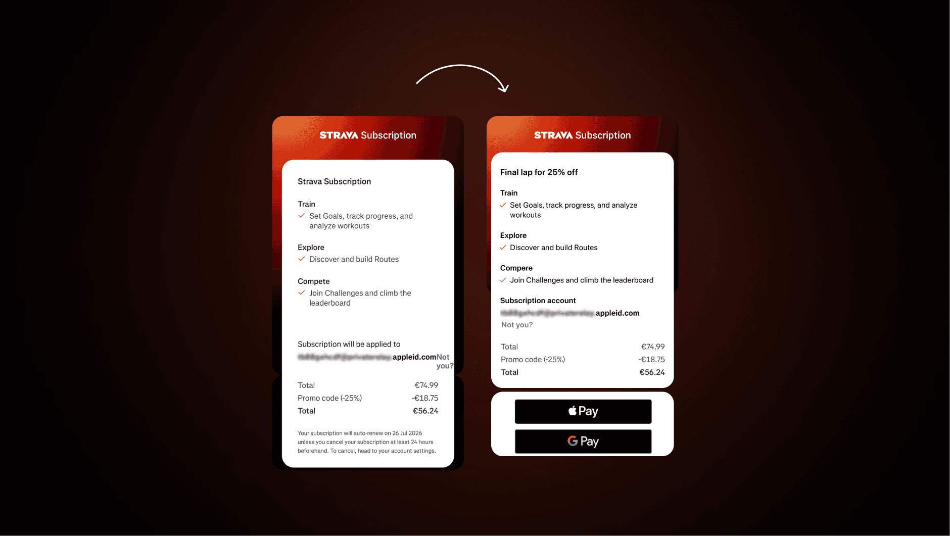
Subscription promotion in app
Subscription promotion in app
Subscription promotion in app
Subscription promotion in app
Subscription promotion in app
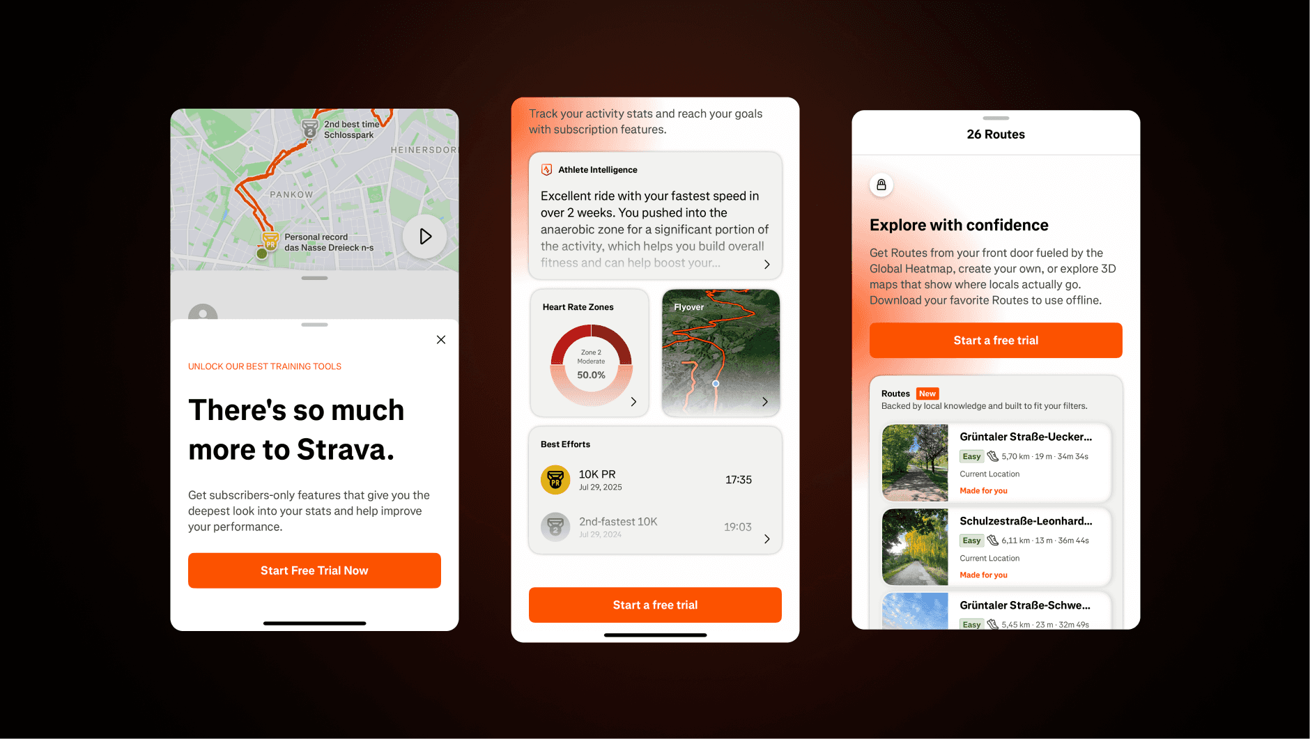
Meanwhile, there isn’t a standard onboarding flow to convert users during the first session. Instead, they aggressively push subscription offers throughout the app.
Meanwhile, there isn’t a standard onboarding flow to convert users during the first session. Instead, they aggressively push subscription offers throughout the app.
Meanwhile, there isn’t a standard onboarding flow to convert users during the first session. Instead, they aggressively push subscription offers throughout the app.
Meanwhile, there isn’t a standard onboarding flow to convert users during the first session. Instead, they aggressively push subscription offers throughout the app.
Highlights to learn
Highlights to learn
Highlights to learn
Highlights to learn
Highlights to learn
1.Presure users with linited time offers
1.Presure users with linited time offers
1.Presure users with linited time offers
1.Presure users with linited time offers
Strava goes hard on FOMO: “Final lap for 25% off,” timers, last-chance overlays. Urgency can move people, but on its own it feels empty.
Strava goes hard on FOMO: “Final lap for 25% off,” timers, last-chance overlays. Urgency can move people, but on its own it feels empty.
Strava goes hard on FOMO: “Final lap for 25% off,” timers, last-chance overlays. Urgency can move people, but on its own it feels empty.
Strava goes hard on FOMO: “Final lap for 25% off,” timers, last-chance overlays. Urgency can move people, but on its own it feels empty.
Strava goes hard on FOMO: “Final lap for 25% off,” timers, last-chance overlays. Urgency can move people, but on its own it feels empty.
There should also be an anchor to the offer in real motivation. Tie the discount to progress. “You’re one run from your weekly goal 40km. Lock in Pro now with 25% off.” Scarcity works when it amplifies momentum, not pressure.
There should also be an anchor to the offer in real motivation. Tie the discount to progress. “You’re one run from your weekly goal 40km. Lock in Pro now with 25% off.” Scarcity works when it amplifies momentum, not pressure.
There should also be an anchor to the offer in real motivation. Tie the discount to progress. “You’re one run from your weekly goal 40km. Lock in Pro now with 25% off.” Scarcity works when it amplifies momentum, not pressure.
There should also be an anchor to the offer in real motivation. Tie the discount to progress. “You’re one run from your weekly goal 40km. Lock in Pro now with 25% off.” Scarcity works when it amplifies momentum, not pressure.
There should also be an anchor to the offer in real motivation. Tie the discount to progress. “You’re one run from your weekly goal 40km. Lock in Pro now with 25% off.” Scarcity works when it amplifies momentum, not pressure.

2.The value should be obvious, not buried in text
2.The value should be obvious, not buried in text
2.The value should be obvious, not buried in text
2.The value should be obvious, not buried in text
Many of Strava’s promotions lean on long descriptions that are hard to scan.
Many of Strava’s promotions lean on long descriptions that are hard to scan.
Many of Strava’s promotions lean on long descriptions that are hard to scan.
Many of Strava’s promotions lean on long descriptions that are hard to scan.
Many of Strava’s promotions lean on long descriptions that are hard to scan.
Users don’t want to decode dense copy. They want a clear list of benefits that immediately answers “Why upgrade?” The value should be visible in short bullets or headlines, reinforced by strong titles. Easy-to-read value sells better than walls of text.
Users don’t want to decode dense copy. They want a clear list of benefits that immediately answers “Why upgrade?” The value should be visible in short bullets or headlines, reinforced by strong titles. Easy-to-read value sells better than walls of text.
Users don’t want to decode dense copy. They want a clear list of benefits that immediately answers “Why upgrade?” The value should be visible in short bullets or headlines, reinforced by strong titles. Easy-to-read value sells better than walls of text.
Users don’t want to decode dense copy. They want a clear list of benefits that immediately answers “Why upgrade?” The value should be visible in short bullets or headlines, reinforced by strong titles. Easy-to-read value sells better than walls of text.
Users don’t want to decode dense copy. They want a clear list of benefits that immediately answers “Why upgrade?” The value should be visible in short bullets or headlines, reinforced by strong titles. Easy-to-read value sells better than walls of text.
3.Make the Buy CTA consistently visible
3.Make the Buy CTA consistently visible
3.Make the Buy CTA consistently visible
3.Make the Buy CTA consistently visible
Strava’s web checkout tucks the main button below the fold, so you have to scroll to act. On other screens it’s right there, and the difference shows.
Strava’s web checkout tucks the main button below the fold, so you have to scroll to act. On other screens it’s right there, and the difference shows.
Strava’s web checkout tucks the main button below the fold, so you have to scroll to act. On other screens it’s right there, and the difference shows.
Strava’s web checkout tucks the main button below the fold, so you have to scroll to act. On other screens it’s right there, and the difference shows.
Strava’s web checkout tucks the main button below the fold, so you have to scroll to act. On other screens it’s right there, and the difference shows.
At checkout or paywall, the CTA should be visible without a scroll. Keep it consistent across platforms to cut friction and stop losing buyers who are already ready to pay.
At checkout or paywall, the CTA should be visible without a scroll. Keep it consistent across platforms to cut friction and stop losing buyers who are already ready to pay.
At checkout or paywall, the CTA should be visible without a scroll. Keep it consistent across platforms to cut friction and stop losing buyers who are already ready to pay.
At checkout or paywall, the CTA should be visible without a scroll. Keep it consistent across platforms to cut friction and stop losing buyers who are already ready to pay.
At checkout or paywall, the CTA should be visible without a scroll. Keep it consistent across platforms to cut friction and stop losing buyers who are already ready to pay.

Feel free to send me a love letter or a formal inquiry. I welcome both!
Feel free to send me a love letter or a formal inquiry. I welcome both!
Feel free to send me a love letter or a formal inquiry. I welcome both!
Feel free to send me a love letter or a formal inquiry. I welcome both!
Feel free to send me a love letter or a formal inquiry. I welcome both!
kovva.stas@gmail.com